Week6 Play Journal
Casino Bot
- A lesson about game UI design
The design topic for project 2 is the Asynchronous game. Because of my curiosity about discord bot development and my computer science background, I decide to make a discord bot for this project. (I kind of regret my decision now, but it is what it is. I will explain the reason later)
The game link is here
UI Lessons
I have to say, the most exciting part I experienced in this project is improving the UI of my slot machine game.
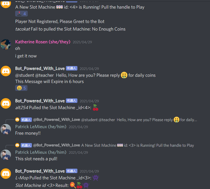
At first, the game message is really messy. People need to look really carefully in order to find the right slot machine. Also, it is really hard for the player to remember what will happen if the

“We should pin the info up top that says what happens if you get certain results from the slots” – Brandon Fields (2021)
As a result, I start to focus on how to make the interface of casino bot clearer to the users. Casino bot, unlike other bots such as Pokemon bots and Gotcha bots (actively replies to player commands), requires users scrolling back to find a specific message to interact with.
In order to let players find the message and information easier, I did these improvements in my first update.

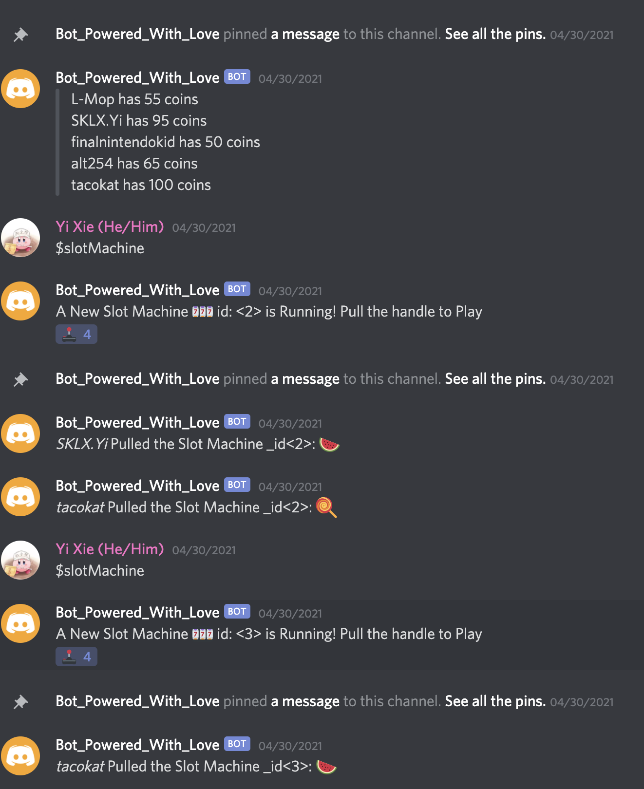
Highlights: Pin Active Messages to help players navigating them Send rules and leader boards every 6 hours so that players don’t need to use commands to review this info.
This is how it looks.

It looks good comparing the previous version. However, it is still hard to read and follow. One thing I notice is that all the message looks same when I sit away from the monitor. It means that the UI is still hard to read. There are no distinct areas for different information and notification.
** I want players can tell what kind of notification is it without looking closely at the screen and read out the words one by one**
And here comes the second update.

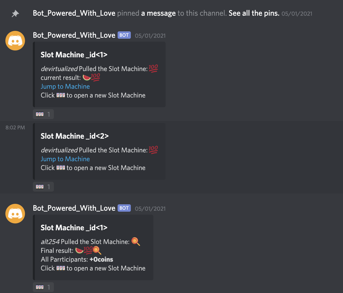
And it looks like this.

I use embedded links to form DOMs in the discord channel and use links to help users go to activating slot machines.
And later I realized that images and non-text representations are easier for users to use even though I am designing a bot for text chat.
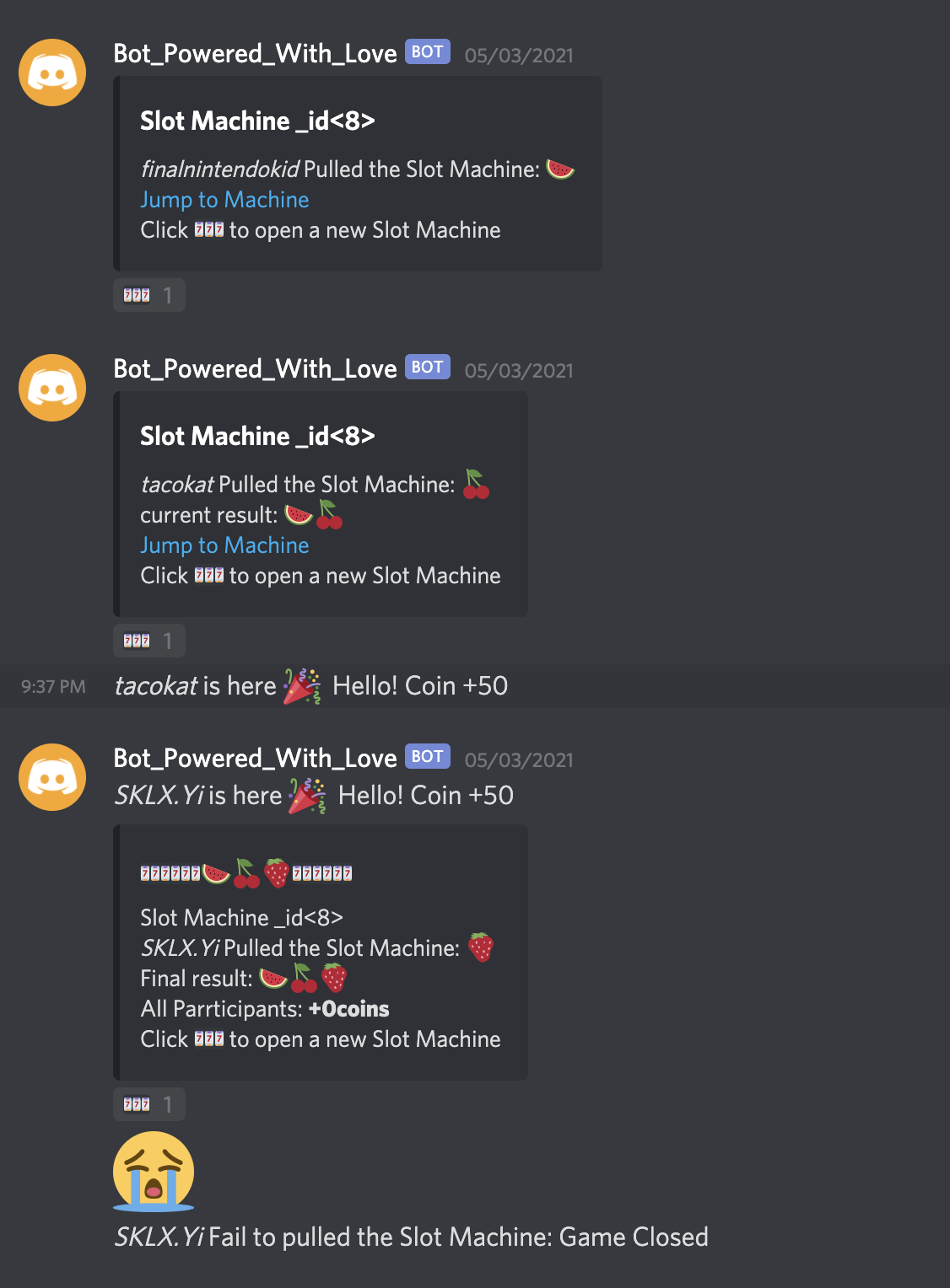
Here is the final version before I write this div log:

I try to let the users type as little as possible and try to let the users read as little as possible.
While I am working on a textbase platform, it is still important to do my best to make everything well organized and clean.
My Efforts Put in UI Design makes me BLIND in Gameplay Design.
As Patrick points out while critiquing my work, there are game balancing issue happening. While I developing the bot, I am thinking about making an asynchronous game that let everyone in the server participates. On the UI’s aspect, I already make the bot easy to use and reduce the inconvenience as much as possible. However, the game is not interesting enough on competition, risk sharing and corporation.
It looks like an asynchronous game, but it is nothing but a bot that asking people to follow a couple of procedures and get to the top of the server if they have luck.
There is nothing in there that lures the players to keep playing, and the reason for that is the lack of game system design. This is a really great game balancing lesson on gotcha games and casino games. I am still thinking about the balancing solution for casino bots now. This experience brings up questions about the multiplayer balancing issue in the Casino game and gotcha game for me.
- How to encourage players to compete with each other?
- If players need to share the risk, how to distribute rewards and responsibilities?
- How to use a well-designed game system implicitly give negative feedback to idle players?
Play During the Pandemic
It is an itch.io page that records all the exciting stuff that happens during the CDM 198 Spring 2021.
| Status | In development |
| Category | Physical game |
| Author | Yi |
More posts
- Final Final PlayJournalJun 07, 2021
- Final Play JournalMay 31, 2021
- Week 8 Play JournalMay 23, 2021
- Week7 Play JournalMay 15, 2021
- Week5 Play JournalMay 03, 2021
- Week4 Play JournalApr 25, 2021
- Week3 Play JournalApr 17, 2021
- Week2 Play JournalApr 11, 2021
- Week1 Play JournalApr 04, 2021
Leave a comment
Log in with itch.io to leave a comment.